生物信息与R语言QQ群: 187923577
Tips: 看不清请刷新,换个颜色再看。
1. 比较干净的背景: +theme_bw(); 最干净的背景: +theme_classic()
2. 参数的解释: 生物慕课网
3. 本页面最顶/底部有生信QQ群号,欢迎加入讨论,严禁广告。
详情查看githug上 survminer 包官方示例。
大佬写过 好几个高层包: ggpubr, factoextra, survminer, ggcorrplot, rstatix, datarium。
# 展示的是最后一个代码的图。
# load data ####
library("survival")
library("survminer")
data("lung")
#write.table(lung, "lung.df.txt")
dim(lung) #228 10
head(lung) #sex: Male=1 Female=2
# inst time status age sex ph.ecog ph.karno pat.karno meal.cal wt.loss
#1 3 306 2 74 1 1 90 100 1175 NA
#2 3 455 2 68 1 0 90 90 1225 15
#3 3 1010 1 56 1 0 90 90 NA 15
# inst: Institution code
# time: Survival time in days
# status: censoring status 1=censored, 2=dead (用1/2编码是历史习惯)
# age: Age in years
# sex: Male=1 Female=2
# ph.ecog: ECOG performance score as rated by the physician.
# 0=asymptomatic,
# 1= symptomatic but completely ambulatory,
# 2= in bed <50% of the day,
# 3= in bed > 50% of the day but not bedbound,
# 4 = bedbound
# ph.karno: Karnofsky performance score (bad=0-good=100) rated by physician
# pat.karno: Karnofsky performance score as rated by patient
# meal.cal: Calories consumed at meals
# wt.loss: Weight loss in last six months
boxplot(time~status, data=lung)
#只需要三列: time, status, 分类变量
# 分类变量可以是表达值、某个组合打分等和阈值的比较,结果是二分类的即可。
# 看性别是否对生存期有影响
# 构建模型
fit = survfit(Surv(time, status) ~ sex, data=lung)
# 绘制原生KM曲线
plot(fit)
#可优化点:
#1)区分两条线的颜色和legend
#2)坐标轴,标题,主题优化
#3)Risk table
#4)P值,OR值,CI值等注释信息
#1) 线的颜色是啥?----
p1 = ggsurvplot(fit)
p1
#2) 坐标轴,标题,主题优化 ----
p2 = ggsurvplot(fit, data = lung,
surv.median.line = "hv", #添加中位生存曲线
palette=c("red", "blue"), #更改线的颜色
legend.labs=c("Male","Female"), #标签
legend.title="Treatment", #图例标题
title="Overall survival", #标题
ylab="Cumulative survival (percentage)", xlab = " Time (Days)", #更改横纵坐标
censor.shape = 124, censor.size = 2, conf.int = FALSE, #删失点的形状和大小
break.x.by = 100 #横坐标间隔
)
p2
# 以上基本就完成了KM曲线颜色,线型大小,标签,横纵坐标,标题,删失点等的修改,Q2搞定!
# 注意:中位生存时间表示 50% 的个体尚存活的时间,而不是生存时间的中位数!
#3) Risk Table ----
p3 = ggsurvplot(fit, data = lung,
surv.median.line = "hv", #添加中位生存曲线
palette=c("red", "blue"),
legend.labs=c("Male","Female"), #标签
legend.title="Treatment",
title="Overall survival",
ylab="Cumulative survival (percentage)",xlab = " Time (Days)", #更改横纵坐标
censor.shape = 124,censor.size = 2,conf.int = FALSE,
break.x.by = 100,
risk.table = TRUE,tables.height = 0.2,
tables.theme = theme_cleantable(),
ggtheme = theme_bw())
p3
# 注 tables.height可调整为看起来“舒服”的高度
# 根据risk table 可以看出关键点的当前状态,Q3摆平!
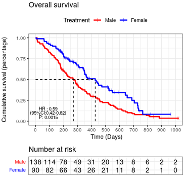
#4) 添加注释信息 ----
# 添加KM的P值
P4 = ggsurvplot(fit, data = lung,
pval = TRUE,#添加P值
pval.coord = c(0, 0.03), #调节Pval的位置
surv.median.line = "hv", #添加中位生存曲线
palette=c("red", "blue"),
legend.labs=c("Male","Female"), #标签
legend.title="Treatment",
title="Overall survival",
ylab="Cumulative survival (percentage)",xlab = " Time (Days)", #更改横纵坐标
censor.shape = 124,censor.size = 2,conf.int = FALSE,
break.x.by = 100,
risk.table = TRUE,tables.height = 0.2,
tables.theme = theme_cleantable(),
ggtheme = theme_bw())
P4
# pval.coord可以调节P值得位置
# 添加COX回归hazard ratio值等相关信息 ----
###添加HR ,CI ,P
res_cox = coxph(Surv(time, status) ~sex, data=lung)
p5=p3
p5$plot = p3$plot +
ggplot2::annotate("text",x = 90, y = 0.15, size=3,
label = paste("HR :",round(summary(res_cox)$conf.int[1],2))) +
ggplot2::annotate("text",x = 90, y = 0.10, size=3,
label = paste("(","95%CI:",round(summary(res_cox)$conf.int[3],2),
"-",round(summary(res_cox)$conf.int[4],2),")",sep = ""))+
ggplot2::annotate("text",x = 90, y = 0.05, size=3,
label = paste("P:",round(summary(res_cox)$coef[5],4)))#+
#ggplot2::theme( axis.text.x = element_text(face="bold", color="blue", size=8))
p5
# 添加其他信息
# 可类似上述annotation得方式,使用ggplot2添加文字,箭头,公式等其他信息
就是 一根柱子加上一个圆,类似传统的柱状图,但是提供了更多的信息。
暂时无图。等学深入了再补充图。
library(ggpubr)
#微调数据,添加 name列,设置cyl位因子
dfm=mtcars
dfm$name=rownames(dfm)
dfm$cyl=as.factor(dfm$cyl)
head(dfm)

# 1.基本
ggdotchart(dfm, x = "name", y = "mpg",
           color = "cyl",       # 按照cyl填充颜色
           palette = c("#00AFBB", "#E7B800", "#FC4E07"), # 修改颜色
           sorting ="descending", #"ascending",
           add = "segments",        # 添加棒子
           ggtheme = theme_pubr(),  # 改变主题
           #rotate=T,
           xlab=""
)


# 2.横着,添加小球和数字
ggdotchart(dfm, x = "name", y = "mpg",
           color = "cyl",       # 按照cyl填充颜色
           palette = c("#00AFBB", "#E7B800", "#FC4E07"), # 修改颜色
           sorting = "descending",
           add = "segments",          # 添加棒子
           add.params = list(color = "lightgray", size = 1.5),#改变棒子参数
           rotate = TRUE,              # 方向转为垂直
           group = "cyl",
           dot.size = 6,               # 改变点的大小
           label = round(dfm$mpg),     # 添加label
           font.label = list(color = "white", size = 9,
                             vjust = 0.5),   # 设置label参数
           ggtheme = theme_pubr(),           # 改变主题
           xlab=""
)
如果一个是分面的,则很难能否对齐坐标轴,但也不是不可能。参数 axis = "bt" 很关键。
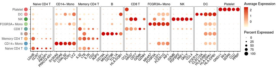
# 预先准备好 Seurat(v4.0.4) 对象sce和各个类之间的差异基因top11。

> sce
An object of class Seurat
13714 features across 745 samples within 1 assay
Active assay: RNA (13714 features, 2000 variable features)
 3 dimensional reductions calculated: pca, umap, tsne

> head(top11)
# A tibble: 6 × 7
# Groups:   cluster [1]
      p_val avg_log2FC pct.1 pct.2 p_val_adj cluster     gene
1 3.75e-112      1.09  0.912 0.592 5.14e-108 Naive CD4 T LDHB
2 9.57e- 88      1.36  0.447 0.108 1.31e- 83 Naive CD4 T CCR7
3 1.15e- 76      0.935 0.845 0.406 1.58e- 72 Naive CD4 T CD3D


# 开始画图
topN=top11 %>% group_by(cluster) %>% top_n(5, wt=avg_log2FC)
dim(topN)
head(topN)

# 使用 Seurat::DotPlot 画主图,并修饰主题。
g0_plot=DotPlot(sce, features=split(topN$gene, topN$cluster),
                cols= c("lightyellow", "red3") )+
  RotatedAxis()+theme(
    # 各个画板
    panel.border = element_rect(color="black"),#要边框
    panel.spacing = unit(1, "mm"), #画板间距

    axis.title = element_blank(), #去掉 坐标轴 label
    axis.text.y=element_blank(), #去掉y轴文字
  ); g0_plot


# 使用 ggplot2 画左边的文字和彩色圆圈。
colors=c("#96C3D8", "#5F9BBE", "#F5B375", "#C0937E", "#67A59B", "#A5D38F", "#4A9D47", "#F19294", "#E45D61", "#3377A9",
         "#BDA7CB", "#684797", "#8D75AF", "#CD9C9B", "#D62E2D", "#DA8F6F", "#F47D2F")
df1=data.frame(x=0, y= levels(sce), stringsAsFactors = F )
df1$y=factor(df1$y, levels = df1$y )
# df1$y
g1_left=ggplot(df1, aes(x,y, color=factor(y) ))+
  geom_point(size=6, show.legend = F)+
  scale_color_manual(values=colors)+
  theme_classic()+
  scale_x_continuous(expand=c(0,0))+
  theme(
    plot.margin =margin(r=0), #no margin on the right
    axis.title = element_blank(),
    axis.text.x = element_blank(),
    axis.ticks = element_blank(),
    axis.line = element_blank(),
    axis.text.y=element_text(size=12)
  ); g1_left


# 拼合图形
library(cowplot)
# https://wilkelab.org/cowplot/articles/aligning_plots.html
# we can align both the bottom and the top axis (axis = "bt").
plot_grid(g1_left, g0_plot, align ="h", axis="bt", rel_widths = c(1, 9))
This solution is based on grobs: find positions of "strip-t" (top strips) and then substitute the rect grobs with line grobs.
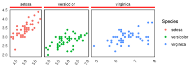
library(ggplot2)

p1=ggplot(iris, aes(Sepal.Length, Sepal.Width, color=Species))+
  geom_point(size=1.5)+
  theme_classic()+
  facet_grid(~Species,
             space = "free_x", #x轴宽度自由
             scales = "free_x")+ #x坐标轴范围自由
  theme(
    panel.border = element_rect(color="black", size=0.8, fill="#00112200"),
    strip.placement = "outside", #分面顶部标签和主图分离
    strip.background = element_rect(linetype = 1, size=2 ), #边框线条
    strip.text.x = element_text(margin = margin(0,0,0.2,0, "cm")), # 控制分面顶部框内边距
    # strip.background = element_rect(),
    axis.line = element_blank(), #不要坐标轴的线
    axis.ticks = element_blank(), #不要坐标轴的刻度
    axis.title = element_blank(), #不要坐标轴label
    axis.text.x=element_text(angle=60, hjust = 1), #旋转60度
); p1


# 去掉分面标签的3面的边
# https://stackoverflow.com/questions/54471816/remove-three-sides-of-border-around-ggplot-facet-strip-label

library(grid)
lg = linesGrob(x=unit(c(0,1),"npc"), y=unit(c(0,0)+0.2,"npc"),
                gp=gpar(col="red", lwd=3))

# grid.newpage(); grid.draw(lg) #预览效果


q = ggplotGrob(p1) #ggplot2 变 grid 对象
q$layout$name #先预览

# 替换
for (k in grep("strip-t",q$layout$name)) {
  q$grobs[[k]]$grobs[[1]]$children[[1]] = lg
}
# 画图
grid.draw(q)
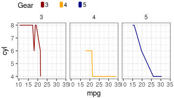
library(ggplot2)
head(mtcars)

cols=c("darkred", "orange","darkblue")

p1=ggplot(mtcars, aes(mpg, cyl, color=factor(gear) ))+
  geom_line()+
  facet_grid(~gear)+
  theme_bw()+
  theme(
    strip.background = element_blank(), #rm分面标题的背景

    legend.position = "top", #图例在上面
    legend.justification = "left", #图例左对齐
    legend.margin=margin(t = 0, r = 0, b = -8, l = 0, unit = "pt"), #move legend litter lower
    legend.title = element_text( margin=margin(r=10) ),
    legend.text = element_text( margin = margin(r = 15)), #每个文字小盒子的外间距
    legend.spacing.x = unit(0, 'mm'), #一个颜色块和对应文字的距离
    legend.key.width = unit(2, "mm"), #control legend width and height
    legend.key.height = unit(3, "mm"), #最大空间的高度(可能用不到,但最多这么多)
  )+
  scale_color_manual(name="Gear", values=cols)+
  guides(color = guide_legend(override.aes = list(size = 3, title="Gear")));p1

{
	#1. ggplot 2 grob
	q = ggplotGrob(p1)
	q$layout$name
	length(q$layout$name)

	#2. define round rect Grob
	library(grid)
	getRR=function(color="red"){
	  roundrectGrob(width=0.5, height=0.9,
					r=unit(0.3, "snpc"),
					gp=gpar(col=color, fill=color))
	}
	#3. replace ggplot legend box with Grob
	q$grobs[[20]]$grobs[[1]]
	q$grobs[[20]]$grobs[[1]]$grobs[[3]]=getRR(cols[1])
	q$grobs[[20]]$grobs[[1]]$grobs[[4]]=zeroGrob()
	q$grobs[[20]]$grobs[[1]]$grobs[[5]]=getRR(cols[2])
	q$grobs[[20]]$grobs[[1]]$grobs[[6]]=zeroGrob()
	q$grobs[[20]]$grobs[[1]]$grobs[[7]]=getRR(cols[3])
	q$grobs[[20]]$grobs[[1]]$grobs[[8]]=zeroGrob()

	#4. draw
	grid.newpage()
	grid.draw(q)
}
# https://stackoverflow.com/questions/46683956/create-two-legends-for-one-ggplot2-graph-and-modify-them
pheatmap 的更多教程: 参数示例 |
fontsize参数设定标签字体大小,filename参数设定图片保存名称: pheatmap(test, cellwidth = 15, cellheight = 12, fontsize = 8, filename = "test.pdf")
# 1. 基因子集
apa_factors=list(
  CPSF=c("CPSF1","CPSF2","CPSF3", "CPSF3L", "CPSF4","CPSF4L","CPSF6","CPSF7"),
  CSTF=c("CSTF1","CSTF2","CSTF2T","CSTF3"),
  PABP=c("PABPC1","PABPC1L","PABPC3","PABPC4","PABPC4L","PABPC5","PABPN1"),
  PAPOL=c("PAPOLG", "PAPOLA"),
  other=c("SYMPK", "RBBP6", "WDR33", "FIP1L1", "NUDT21","CLP1", "PCF11")  #无法归类
)

tmp.genes=unique(unlist(c( apa_factors,
      "CD34", "KIT", "SOCS2", "GATA1", "MYC",  #stem cell
      "CSF1RA", "ITGAM", "LYZ", "LST1", "SIRPA", "TYROBP", "CD14", #monocyte marker
      "CCNE2", #"MKI67", "CCNE2", "CCNB1", "CCNB2", #cell cycle?
      "BCAT1", "CBX5", "NPR3")) ) #Stem cell marker


# 2. get tpm
dat.heatmap=gene.tpm[ intersect(rownames(gene.tpm), tmp.genes),]
# rm all 0 rows
dat.heatmap=dat.heatmap[rowSums(dat.heatmap)>0,]
head(dat.heatmap[,1:5])


# 3. plot
library(pheatmap) #https://www.jianshu.com/p/1c55ea64ff3f
# anno columns
annotation_col = data.frame(
  type = gene.long$type,
  row.names = rownames(gene.long)
)
# set colors
ann_colors = list(
  type = c('wt'="#ed553b", 'kd1'="#99b433", 'kd2'="#00a300")
)

# for heatmap, use log scale
pheatmap(log(dat.heatmap+1),
         border_color = "white",
         color = colorRampPalette(c("navy", "white", "firebrick3"))(50), #自定义颜色
         scale="row",
         cluster_cols = T,
         #cluster_rows = F,
         annotation_col = annotation_col, #set anno for column
         annotation_colors = ann_colors, #set colors
         show_colnames = F,

         filename =paste0("FIP1L1_KD/Kasumi-1_FIP1L1_KD_pheatmap-3.pdf"),width=3.9, height=6.5,
         main="FIP1L1 knock down in Kasumi-1",
         clustering_method = "ward.D2") #聚类方法
示例2: pheatmap 聚类并设置间隔
关键参数: gaps_row = c(1,3,7, 10) 适用于非聚类时;cutree_row=5, cutree_cols=5, 适用于聚类时
library(pheatmap)
set.seed(2025)
mat = matrix(rnorm(100), nrow=20)
rownames(mat)=paste0("cell", 1:nrow(mat))
# 相关系数
mat.cor=cor( t(mat), method="spearman")
colnames(mat.cor)=rownames(mat)

# 列注释: 区分前10个ctrl组blue,后10个细胞treat组red
annotation_col = data.frame(
  id=colnames(mat.cor),
  group=c( rep("ctrl", 10), rep("treat", 10) ),
  row.names=1
)
# 设置颜色
ann_colors = list(
  group = c(ctrl = "navy", treat = "deeppink")
)

# 热图
library(grid)
#ComplexHeatmap::pheatmap(mat.cor,
p1=pheatmap::pheatmap(mat.cor,
         #border_color = "white",
         border_color = NA,
         # 加方框:失败
         #add_geom = "rectangles",
         #rect_gp = gpar(fill = "transparent", col = "red", lwd = 3),
         #rect_row = c(1, 5), rect_col = c(2, 7),
         show_rownames = TRUE,
         #gaps_row = c(1,3,7, 10), #适用于非聚类时
         cutree_row=5, cutree_cols=5, #适用于聚类时
         clustering_method = "ward.D2",
         annotation_col = annotation_col, #annotation_row = annotation_row,
         annotation_colors = ann_colors,
         #color = c(colorRampPalette(colors = c("white","yellow"))(20),colorRampPalette(colors = c("yellow","firebrick3"))(20)),
         show_colnames = TRUE, main="cutree demo")
#保存pdf
pdf(paste0("D://other//demo.heatmap.pdf"), width=6, height=5)
grid::grid.newpage()
grid::grid.draw(p1$gtable)
dev.off()
欢迎互相切磋,共同进步: 秋秋号 314649593, 请备注大名、来意。
秋秋群: 生物信息与R语言 187923577 禁止营销活动,否则飞机票。
bioToolKit is part of 生物慕课网 www.biomooc.com